How to Create High-CTR Banner Ads in 5 Minutes (+ Free Templates)
If you’re reading this because you spent three hours yesterday tweaking the hex code of a button on a banner that nobody clicked, close the tab. You are participating in "design theater," and it’s costing you money.
In the world of digital marketing, "pretty" doesn't pay the bills. Clicks do. Most "influencer" advice tells you to focus on brand aesthetic and "visual storytelling." That is recycled garbage. The reality is that the average human attention span is now shorter than that of a goldfish, and your ad is competing with a literal ocean of noise.
If your banner doesn't scream "Click me because I solve your problem" within 0.5 seconds, it’s invisible. At Daily-Ads, we see thousands of creatives pass through our network. We know what actually converts and what is just expensive digital wallpaper.
Today, I’m shattering the myth that you need a degree in Graphic Design to win. I’m giving you the unfiltered blueprint to creating high-CTR (Click-Through Rate) banners in five minutes or less. No fluff. No "creative soul-searching." Just data-backed execution.
The Reality Matrix: Why Your Banners Are Failing
Most marketers fail because they design for themselves, not the user. They want something they can show off in a portfolio. You want something that prints money. Here is the hierarchy of what actually drives a click, in order of importance:
- The Offer (The "What"): If your offer sucks, a gold-plated banner won’t save it.
- Contrast (The "Look"): Does the ad pop against the website background, or does it camouflage?
- The CTA (The "How"): Is it clear exactly what happens when they click?
- The Visuals (The "Who"): Does the image resonate with the target audience’s pain or desire?
If you are spending 90% of your time on step 4, you are spinning your wheels. We’ve seen ugly, high-contrast text-only ads outperform high-production lifestyle photography by 300%. Why? Because they look like information, not like a polished corporate lie.
The 5-Minute Execution Blueprint
Stop overcomplicating the process. You don't need Photoshop. You need a system. If you can’t produce a winning creative in five minutes, your workflow is broken. Here is how you reverse-engineer a high-CTR banner starting now.
Minute 1: Define the Constraint
You cannot design for "everyone." Pick one specific pain point. Are you solving a time problem? A money problem? A status problem?
- Myth: "I need to show all my features."
- The Truth: One feature = one click. Multi-focus ads result in zero-focus results.
Minutes 2-3: Layout & Contrast
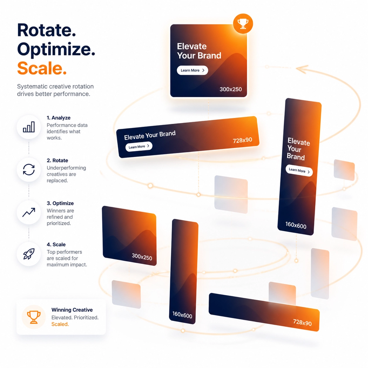
Choose a standard size. At Daily-Ads, we support all standard industry sizes (300x250, 728x90, 160x600, and more). Stick to these. Don't try to be "disruptive" with custom dimensions that no publisher supports.
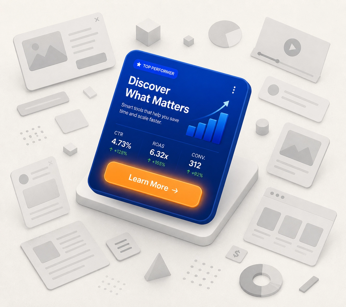
- Pro Tip: Use the "Blink Test." Close your eyes, open them, and look at your banner. If the first thing you see isn't the headline or the button, start over. Use high-contrast colors: yellow on black, white on dark blue, or the classic "Amazon Orange" for buttons.
Minute 4: The "Aggressive" Headline
Your headline should be a punch to the gut or a hand-delivered solution.
- Weak: "Our Marketing Software is the Best."
- High-CTR: "Stop Wasting $500/Day on Ghost Clicks." The latter targets a specific fear (wasting money) and a specific number. Numbers ground your claims in reality.
Minute 5: Export & Deploy
Don't "sleep on it." Don't ask for a second opinion from your spouse. Export it and get it into the rotation. Use the Daily-Ads platform to upload your creative and start seeing real-time data.
Design Tips for the 1% CTR Club
Most banners hover around a 0.1% CTR. That is pathetic. If you want to join the 1% club: the elite performers who actually scale: you need to follow these non-negotiable design rules.
1. The Rule of Thirds is for Photographers, Not Ad Buyers
Forget "balanced" design. You want asymmetrical urgency. Put your heavy-hitting headline in the top two-thirds and your CTA in the bottom right. Why? Because we read in an "F" pattern. We start top-left and end bottom-right. Your button should be the destination of their eye's journey.
2. Typography as a Weapon
Use bold, sans-serif fonts. If it looks like it belongs on a wedding invitation, it doesn't belong in an ad. Use font weight to create hierarchy. Your "The Truth" or "Exposed" or "Free" should be twice as big as everything else.
3. The "Free" Factor
If you aren't using the word "Free," you better have a damn good reason. Whether it's a "Free Trial," "Free Report," or "Free Templates," this word is still the most powerful trigger in human psychology.

The Hidden Costs of "Pretty" Tools
You’ll see influencers peddling expensive design suites that take weeks to learn. That is a low-value time waster. You are a marketer, not an illustrator. Use tools that provide pre-made, high-conversion templates.
We recommend checking out Daily-Swipes for inspiration on what is currently working in the market. Don't reinvent the wheel; just align the wheel to your brand.
Why Daily-Ads is the "Unfair Advantage"
Creating the ad is only 50% of the battle. The "messy middle" is where most people quit. They upload one banner, it fails, and they say, "Display ads don't work."
Display ads work fine; your strategy is what failed. To win, you need volume and rotation.
At Daily-Ads, we don't just give you a place to host an image. We provide the network to rotate your banners for free. This is a critical distinction. In most systems, you pay for every tiny test. With us, you can plug in your different creatives and let the data tell you the winner without burning through your entire budget in the first 48 hours.
We support all standard sizes because we know that’s what publishers actually use. If you want to scale to the "Income Hierarchies" where $10k+ days are normal, you need to be where the traffic is. You can check our Platform Stats to see the volume we’re moving.
The Math of a Winning Campaign
Let's look at the logic. If you are paying for impressions:
- Scenario A: 0.1% CTR. 100,000 impressions = 100 clicks.
- Scenario B: 1.0% CTR. 100,000 impressions = 1,000 clicks.
In Scenario B, you just reduced your cost-per-click by 90% without changing your bid. This is how you shatter the competition. They are fighting over pennies while you are getting 10x the traffic for the same price because your creative doesn't suck.
Reality Check: Stop Looking for Shortcuts
I promised you a 5-minute process, and I gave it to you. But don't mistake "fast" for "easy." The work is in the testing. Most people quit after three days. A real professional services their ads by checking the Daily-Flow to see which creatives are fatiguing.
If your CTR drops after a week, it’s not because the platform "broke." It's because the audience has seen your ad four times and they’re bored. Swap it. You have the templates. You have the 5-minute system. There is no excuse.
Your 90-Day Execution Plan
If you’re serious about moving from a "low-value time waster" to a high-ROI marketer, here is your command:
- Commit to 10 Variations: Don't fall in love with one design. Create 10 different banners using the 5-minute method.
- Use Daily-Ads Rotation: Upload your creatives to our all-in-one suite.
- Analyze the Data: After 10,000 impressions, kill the bottom 8. Keep the top 2.
- Iterate: Create 8 new variations based on the winners.
This is the "messy middle." This is where the grit happens. If you’re looking for a "set it and forget it" solution, you’re in the wrong business. Go back to your 9-to-5. But if you want to scale, the tools are right in front of you.
Ready to stop spinning your wheels? Head over to our features page and see how we can automate the heavy lifting for you. The market is saturated with losers: be the one who actually executes.
Stop designing. Start converting.